Visualizations / Oregon Wildfires
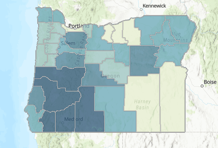
Oregon Wildfires
Description:
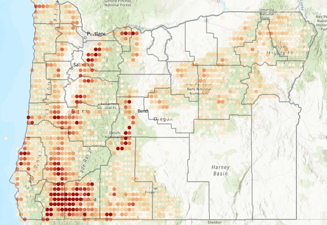
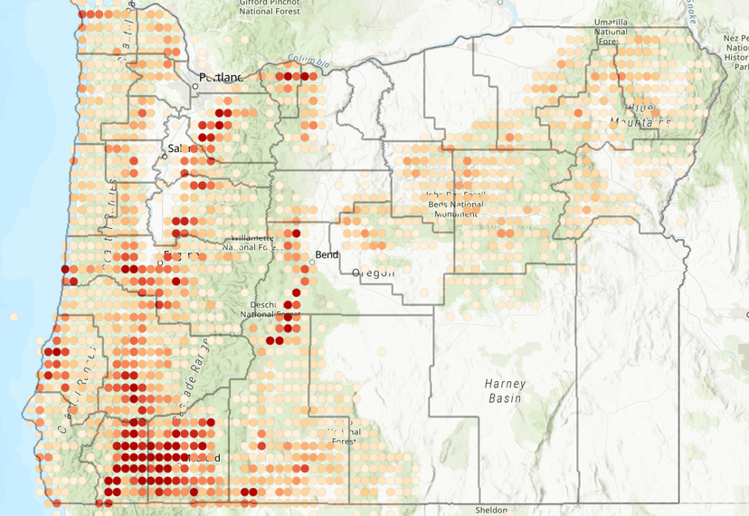
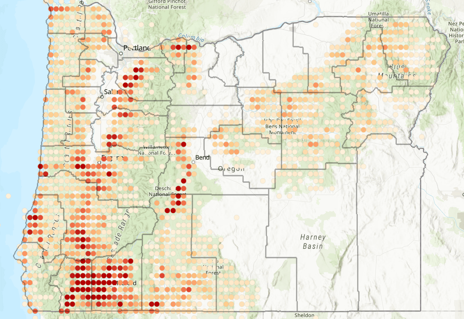
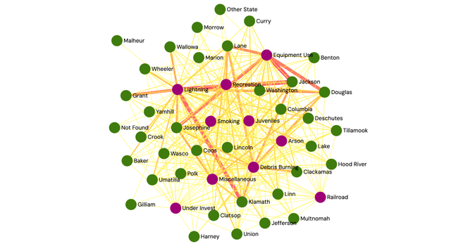
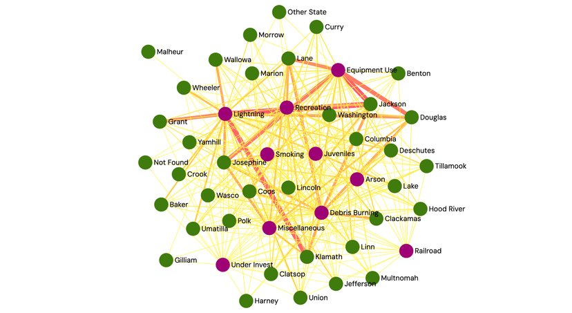
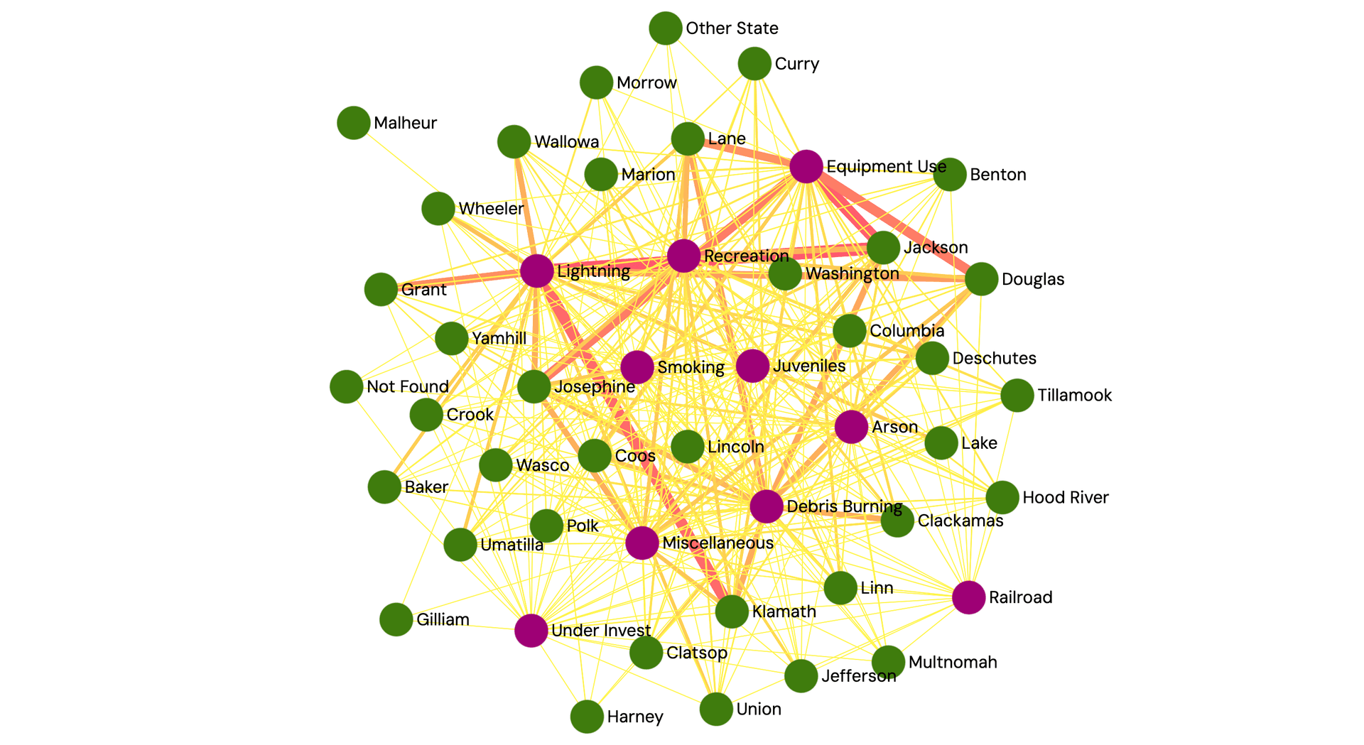
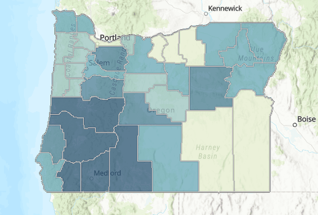
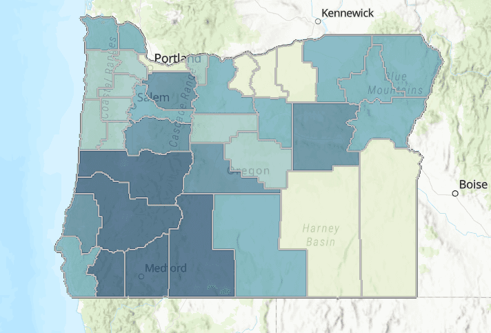
A data visualization project analyzing Oregon Department of Forestry wildfire data from 2000-2025. We examined whether Oregon's worsening wildfire problem reflects genuine severity increases or just better reporting, finding that while fire counts have stayed flat, acres burned has spiked dramatically, particularly in 2020. We used matplotlib for statistical charts, ArcGIS for interactive county maps with per-county cause breakdowns, and Gephi for a network graph mapping cause-county relationships weighted by certainty.Abstract:
An observational analysis of Oregon wildfire data visualized through networks, interactive county maps, and charts. Findings include that fire frequency has remained broadly stable while acres burned has grown substantially, suggesting genuine increases in severity rather than improved detection.